A dashboard for Trac...
Some of the issues that I constantly face is the question of where a project is at, how the project is doing overall, and whether or not the employees are following the company’s coding and release standards. Those aren’t easy questions to answer. Projects are involved and have many dimensions. The requirements change constantly, as do the goals of each milestone. However, I wanted a way to take a snapshot of a project… and not just for me, but it’s developers too. The idea being to present a bunch of graphs showing various features about their project, and it’s “state.” So, one morning, I sat down with Python and Trac and developed Dashboard. I’ve been refining it over the past week or so, but it’s coming along rather nicely. Here are a couple of pictures:
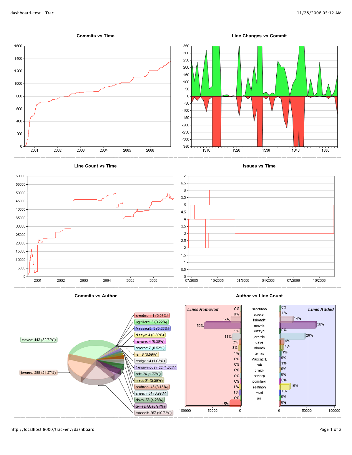
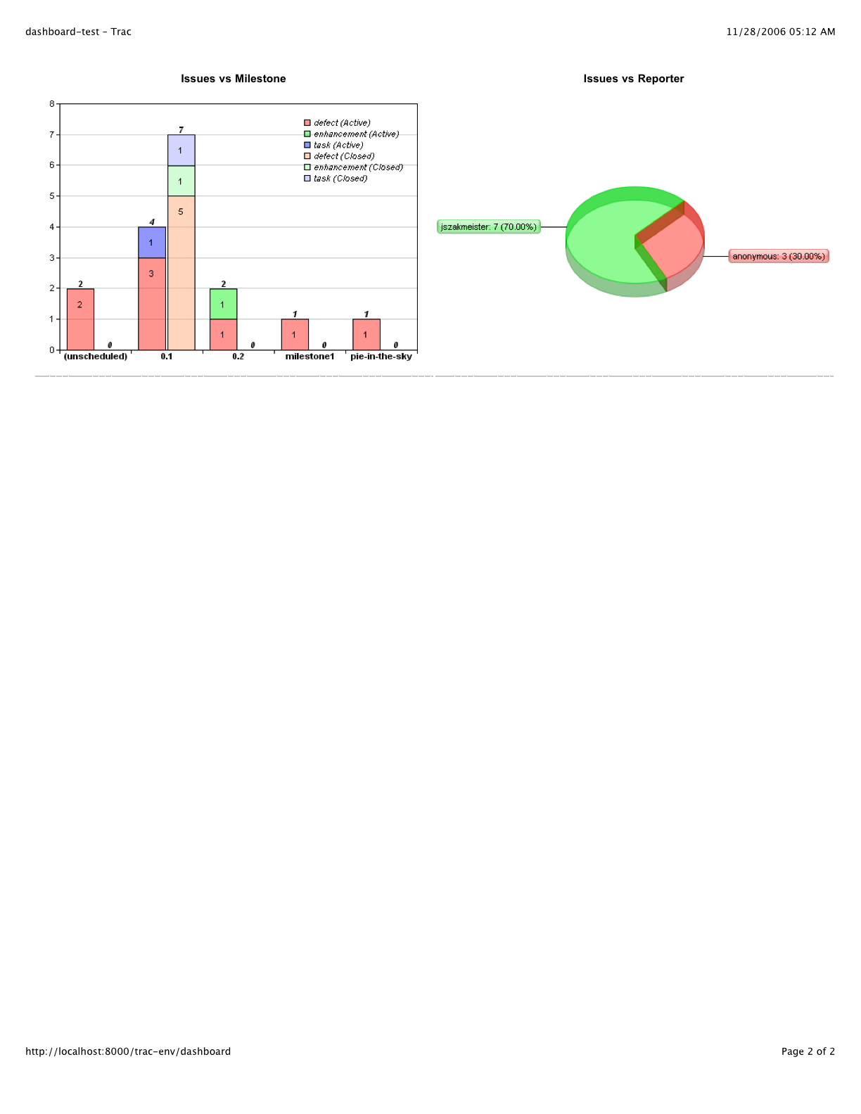
The idea was to get a feel for the commit volume, the amount of churn, the big contributors, the issues over time, the current breakout of the issues right now, and who’s been reporting them. All of the data has to be taken with a grain of salt. For instance, the big contributors. It’s not unusual for use to check in 3rd party code. So seeing Bob top the charts doesn’t necessarily mean that all those lines are his. Likewise, a person who commits and changes things often doesn’t necessarily make them a strong contributor. People make mistakes, and that requires more commits and more changes. But on the whole, you can definitely get a feel for a project, and that’s all I was really after. In a snapshot you can see how many tickets are left for the next milestone (as well as others), and you can see a trend in commits when a release is about to happen. So far, the employees seems to enjoy it. It’s definitely helping me to understand the state of a project. We’ll have to see how it pays off long term, but in the end, it’s at least interesting to see. :-)
The only bad part of this project was the lack of a strong charting library for Python. I’ve been doing most of my development under Mac OS X lately, and I was unable to get any of the GD based charting libraries working well. There were several others out there too, but they didn’t produce a decent quality graph (IMHO). So I resorted to purchasing a license of ChartDirector. It’s actually not a bad product. I wish it did more for you in terms of placing the legend, scaling the axes, and formatting some of the data. But on the whole, it’s a decent product and the cost was very competitive.